Staples Mobile Properties Redesign
iPhone App & Tablet WebApp
Background:
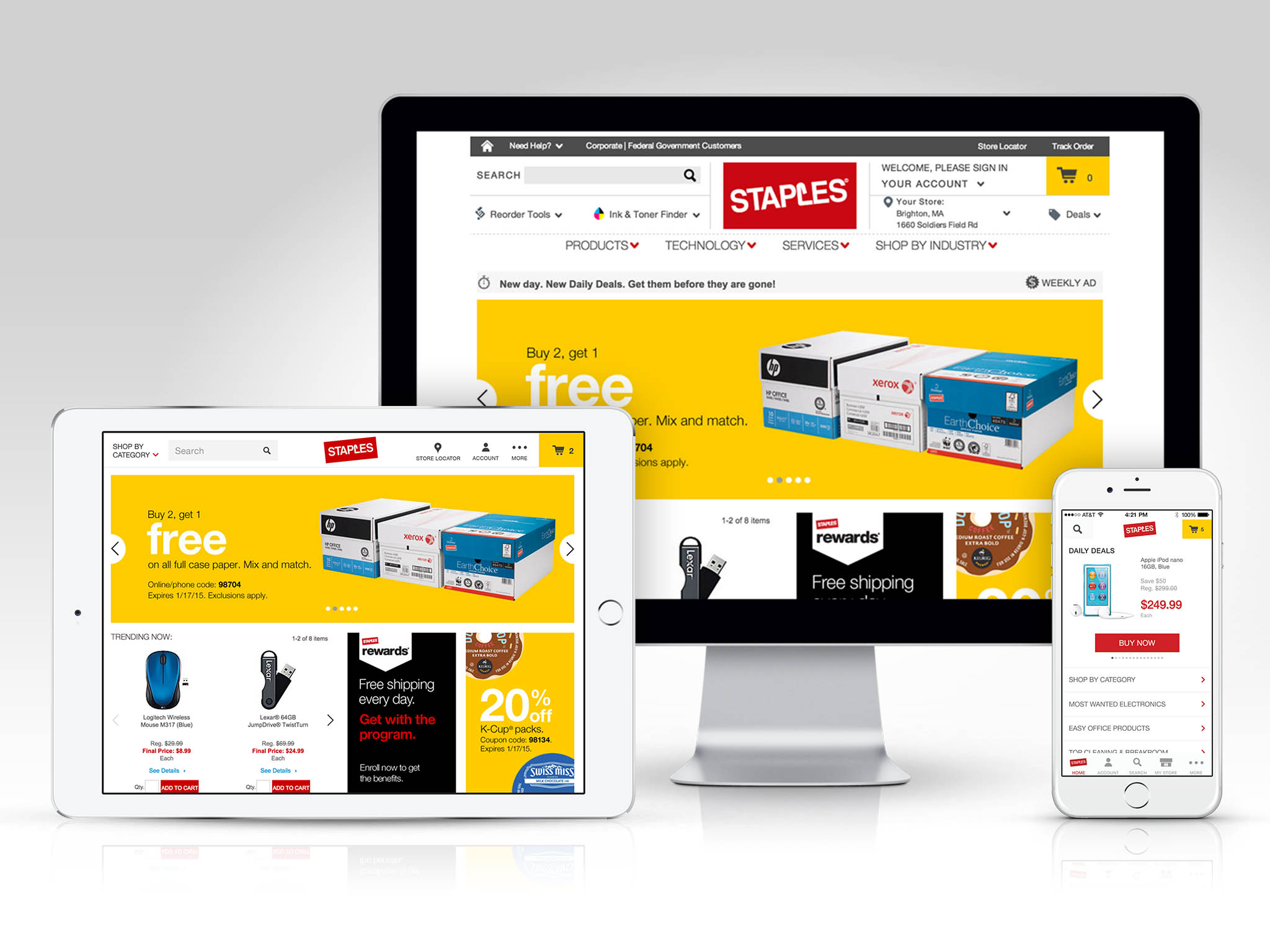
This was the first wave of redesigns to help establish a consistent experience for the Staples mobile audience, regardless of the platform or device they may choose to use. Initially, a global digital style guide was created that every property had to adhere to. After addressing the inconsistencies we focused on the visual DNA of the brand and defined a tone of voice. Finally, considering each platform and their unique navigational paradigms as well as the purpose of these devices (problem solving vs. exploration, etc.) we set out to deliver products that were both optimized for performance and unmistakably on brand. Staples iPhone App
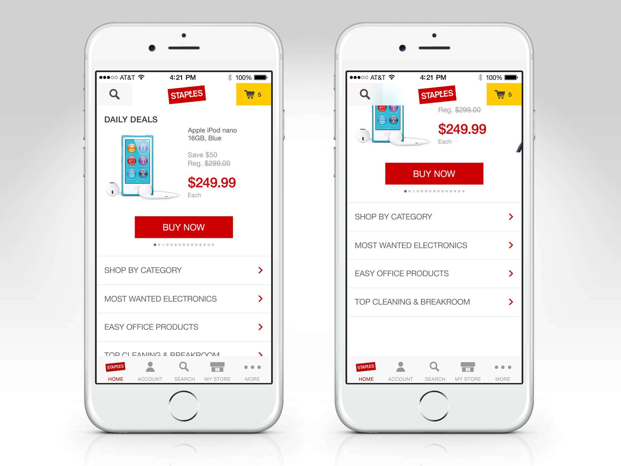
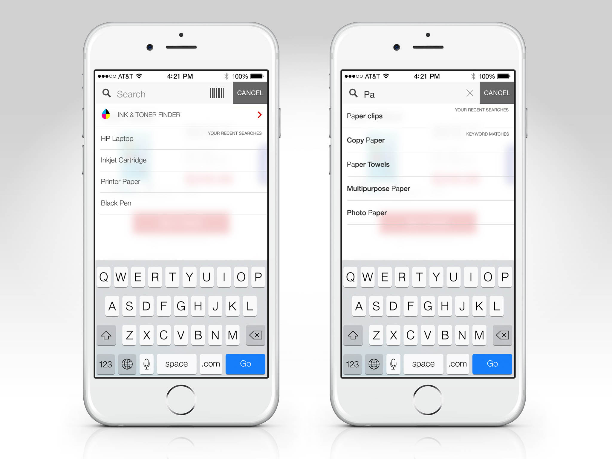
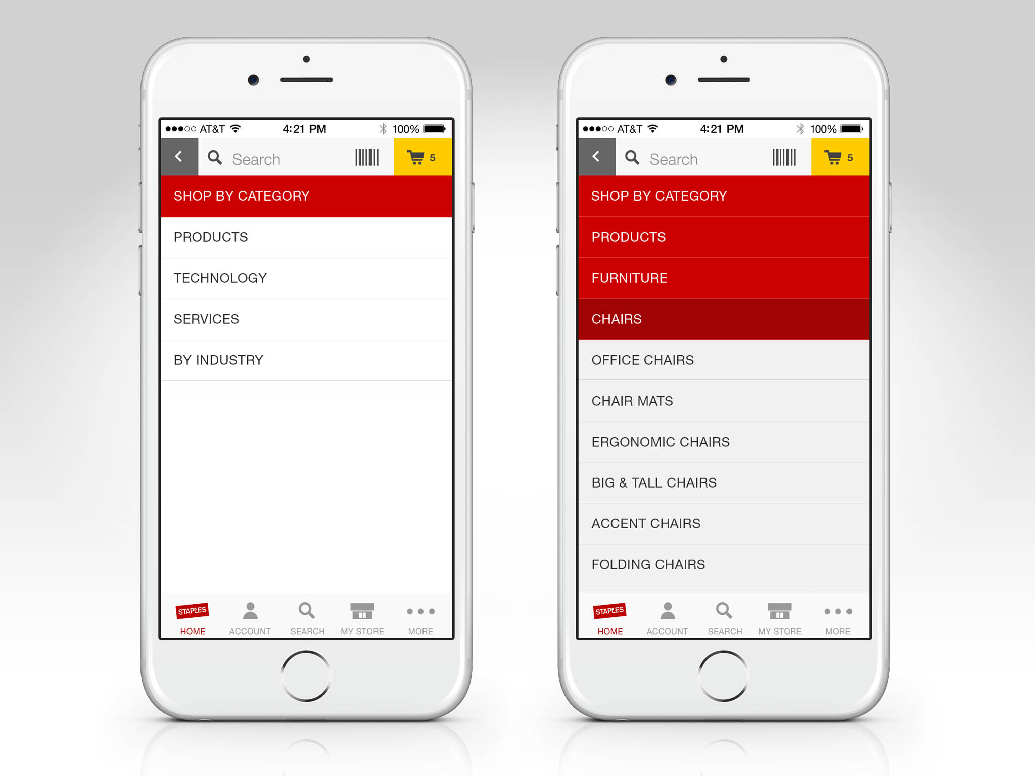
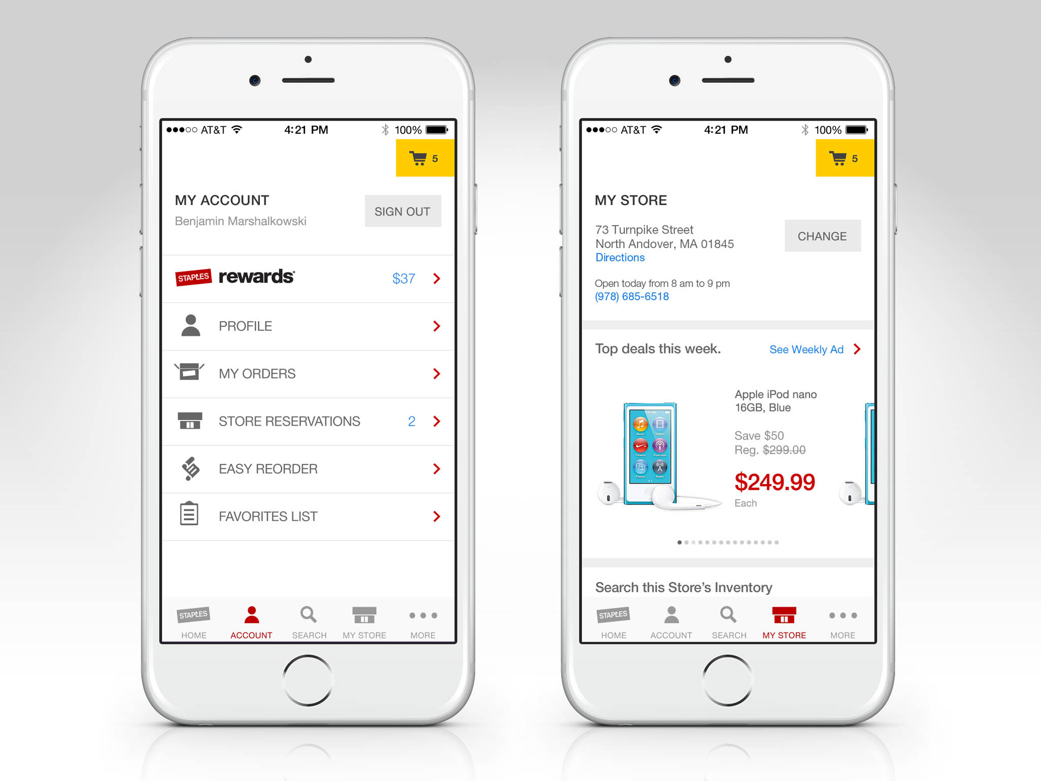
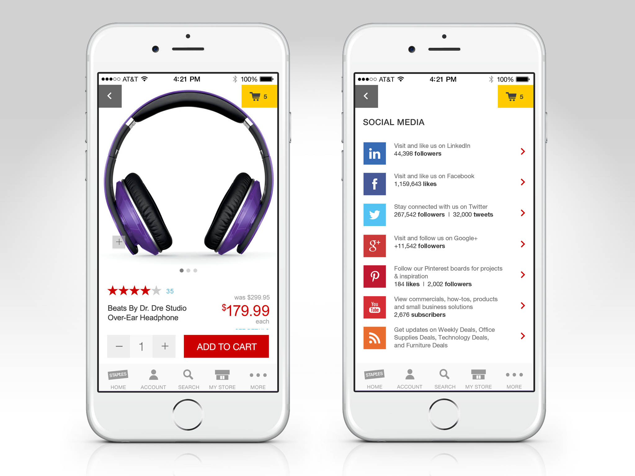
We built the iPhone app from the ground up utilizing native iOS APIs and libraries. The purchase patch was simplified, the UX was optimized per our usability studies, and the amount of clicks to checkout was minimized. The app vastly outperformed its predecessor, got great praise from eth existing customer base, and generated new repeat users.
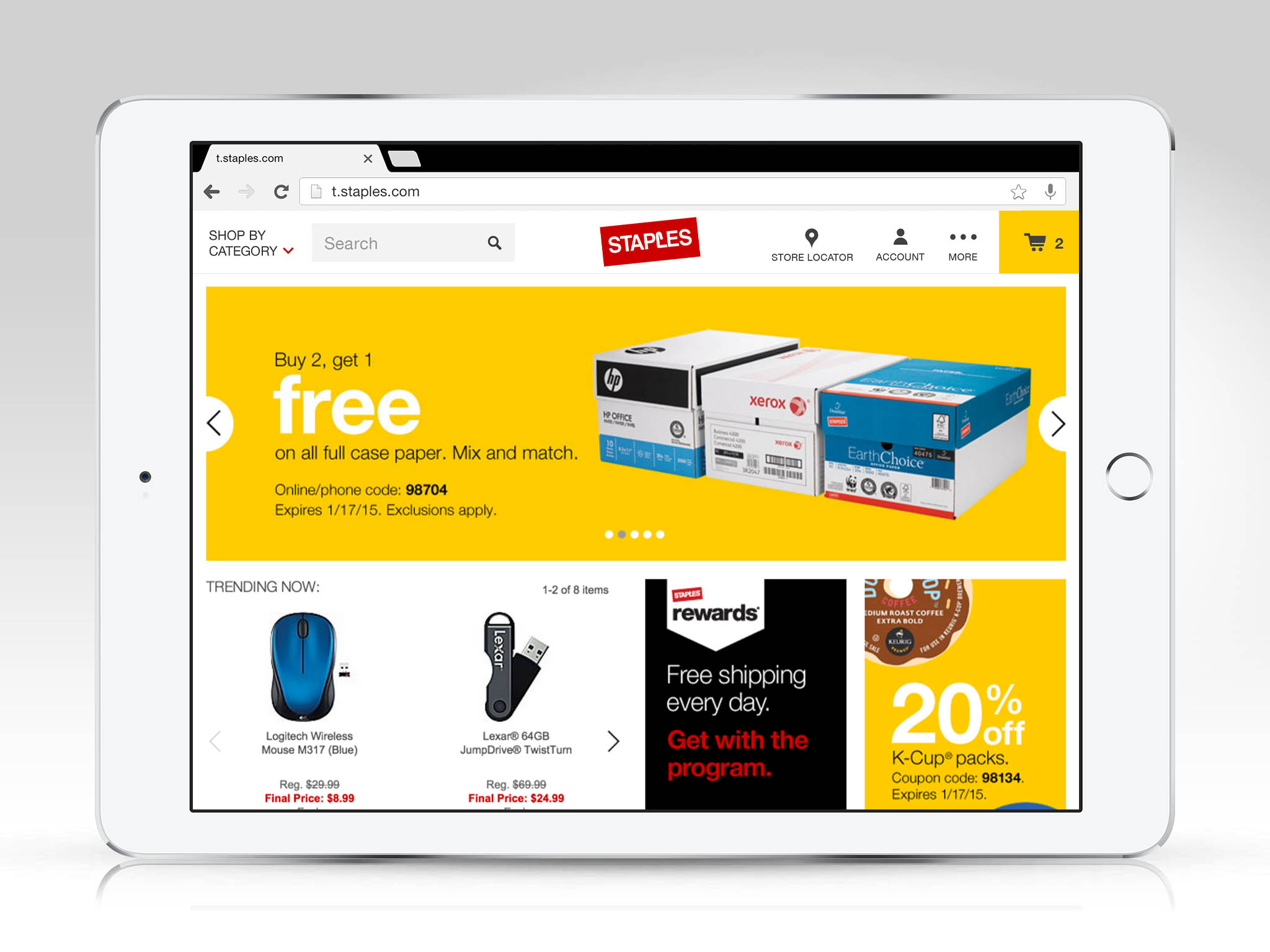
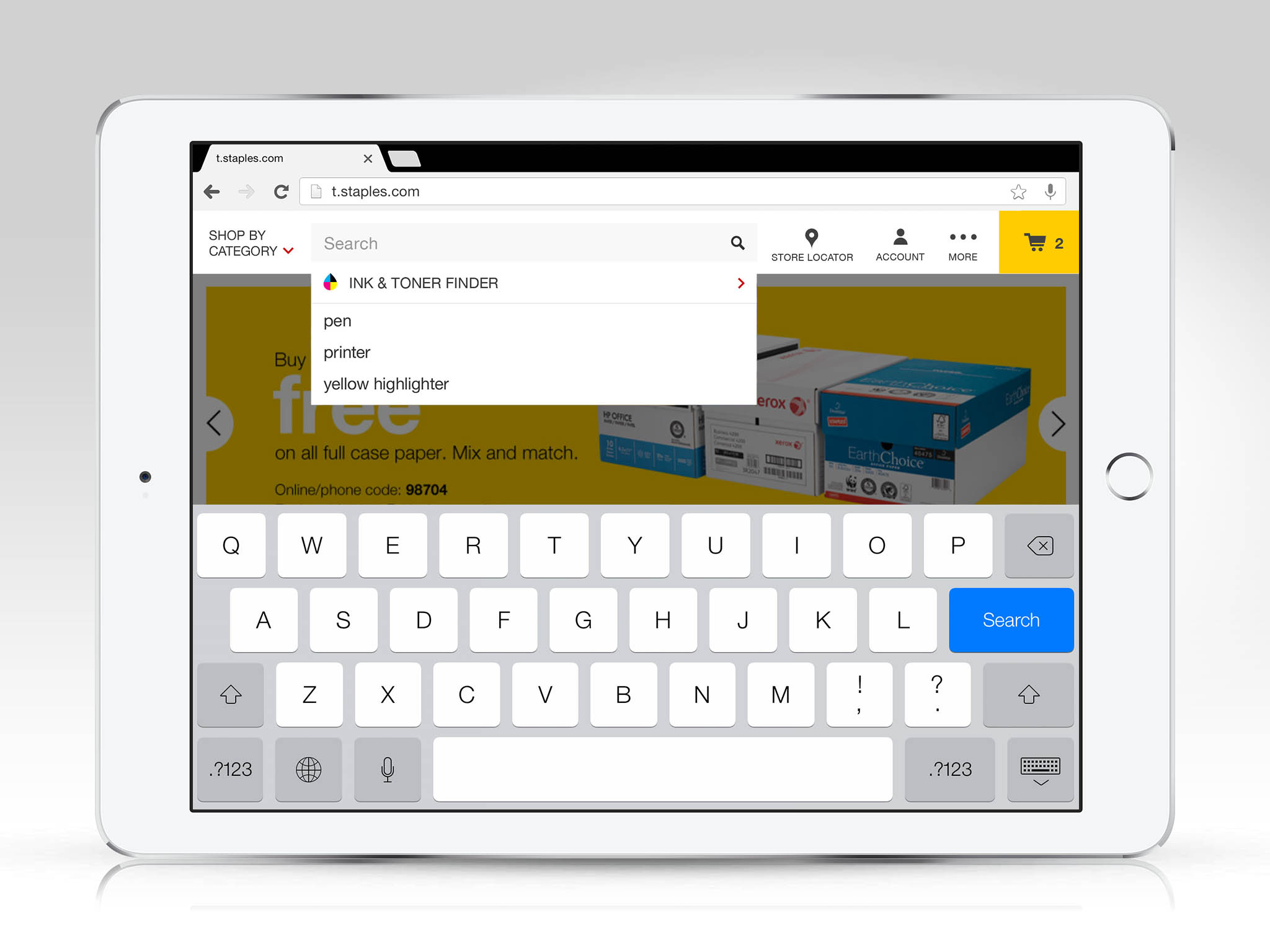
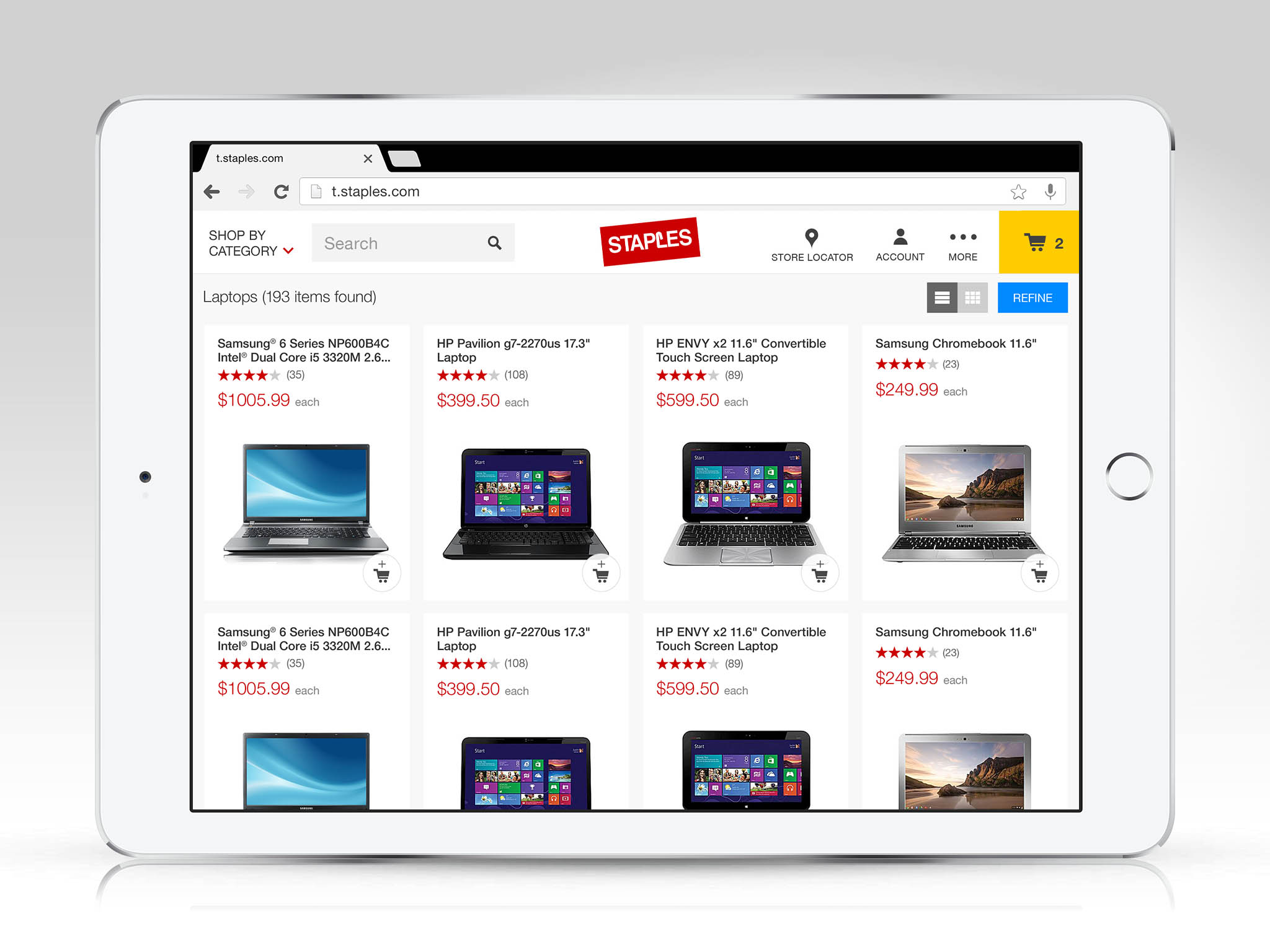
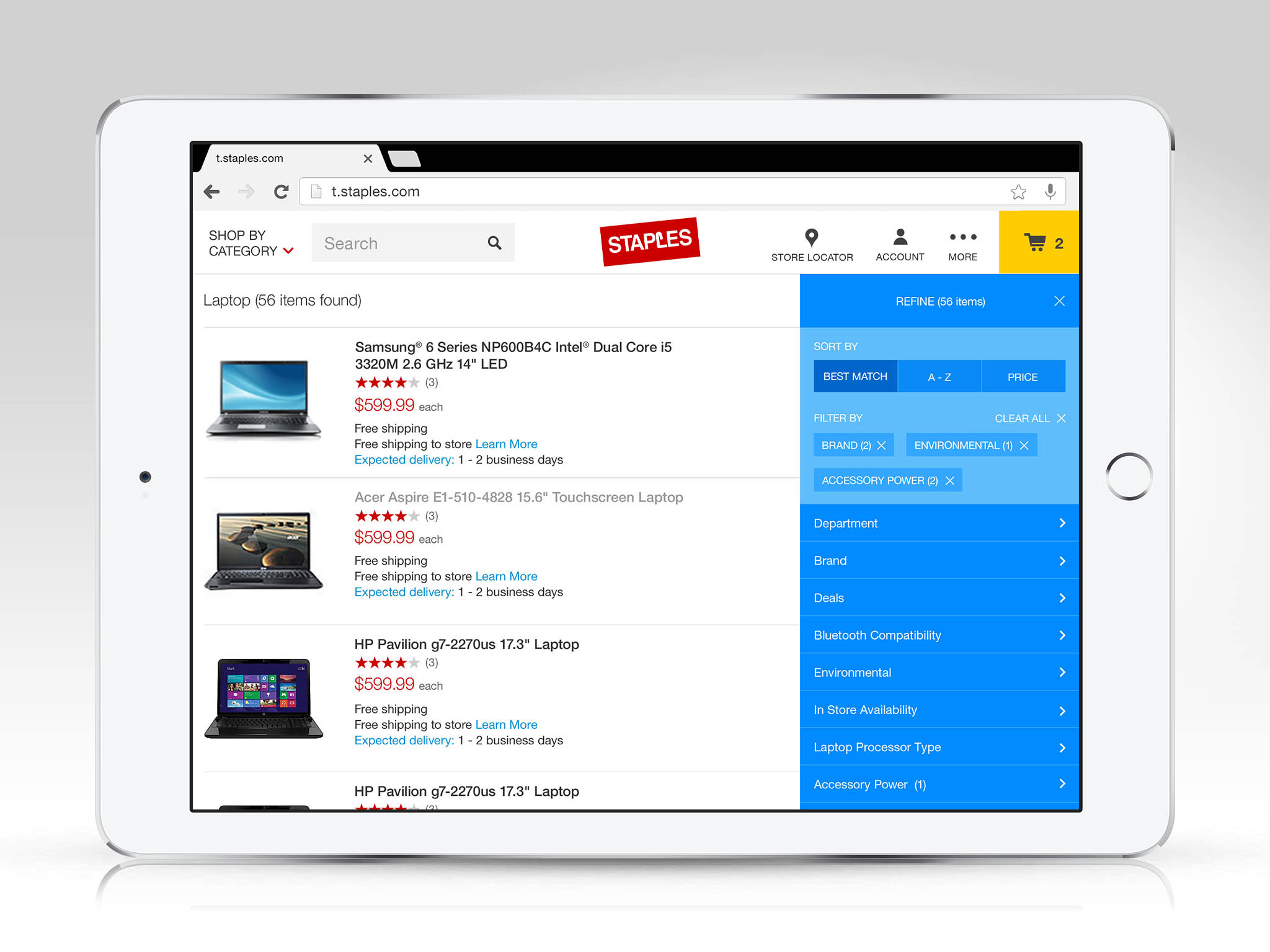
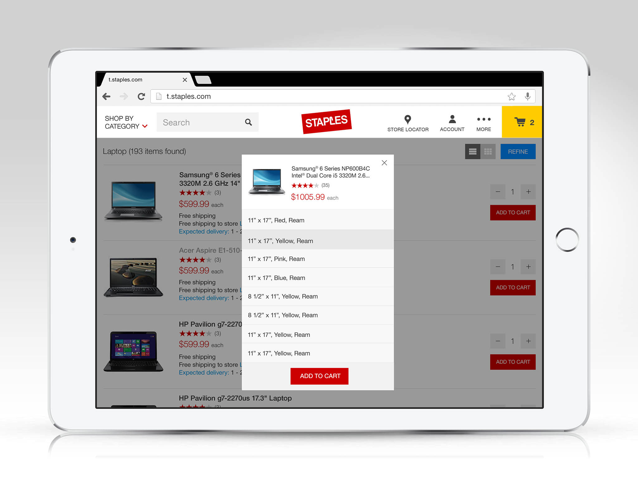
Staples Tablet WebApp
Although there is definite overlap in terms of use, grouping smartphones and tablets into the same mobile bucket is a mistake I see many companies make. The purpose and the audience expectations are different. We set out to design a shopping experience that would be indistinguishable between devices in the tablet form factor. Shortly after launch, there has been a sustained and considerable increase in returning visitors as well as conversion rates.